Flashcard Hub Case Study
Overview


Flashcard Hub is an eLearning app for 18-26 year-olds who need a quick and customizable way to organize complicated college class or new job information so they can study anywhere, anytime.
Problem:
Using the design process, create 2-3 features that make it quick, easy, and fun for users to create and study their own vocabulary flashcards.
Goal:
To create a responsive app that empowers and motivates users to learn new vocabulary.
Tools: Figma, LucidChart, Lyssna, Photoshop, Pencil and Paper
Considerations
User vs. Business Goals
Balancing the need to provide users with enough information about creating their cards and using them in games with business requirements for turning free accounts into paid subscriptions.
Information Balance
Providing enough information for users to help them easily set up cards and build a deck without overwhelming them or giving them unnecessary information.
Feature Overload
Ensuring that features in the create a card, create a deck, and gamification flows provide value to users but are also simple and easy-to-use.
My Design Process

Quick Links:
Competitive Analysis
Research Goals:
Since there are so many flashcard apps available, one of my competitive research goals was to find out if there was an audience(s) that may benefit from a flashcard app designed with them in mind. I also wanted to identify common features top flashcard apps shared (and what makes each unique). Bring on the competitive research!
I analyzed 3 flashcard apps: Quizlet, (one of the biggest), AnkiPro, (medium-sized) and a smaller competitor, Flashtex (small).
I analyzed 3 flashcard apps: Quizlet, (one of the biggest), AnkiPro, (medium-sized) and a smaller competitor, Flashtex (small). After analyzing each apps pros and cons, I concluded that:
- Users would expect to make cards and decks soon after app
downloading. Only 1 competitor gave users quick, clear onboarding directions on making cards/decks so the users would be ready to go when arriving at the home screen. - No competitors provided info icons for users to get more direction about how to best make and organize a deck of cards. I recognized it could be a good differentiator and save users time and confusion.
- Two of the three offered image options, but neither of them had an easy way to do it. I viewed this as an opportunity to design a better, easier/quicker way to insert images.
- All 3 competitors had a general target user (all ages). Narrowing in on an age group most likely to use this type of app will help set it apart.

User Research & Interviews
User Interview Participants
Competitive research found no vocabulary/flashcard apps that focus exclusively on 18-24 year-old college students (or those starting their first job).
Research also showed over 50% of college students regularly use flashcards so it looked promising.
I conducted moderated in-person interviews with five 18-24 year-olds in college/started their first full-time job.
- Elizabeth, age 18, full-time college freshman
- Bella, age 21, beginning 1st post-college full-time job
- Elyse, age 20, full-time student, part-time usher
- Ella, age 20, full-time student, part time bakery job
Interview Questions
- Are you a student, working at your first full-time job, or both? Tell me about your responsibilities or routines.
- What was the first day of your winter semester classes like? What are your biggest challenges when starting a new class or a new job?
- Do you think learning new vocabulary words is difficult? Why or why not?
- Think of a time you were frustrated with jargon or a list of vocabulary words. Why was it frustrating? What would have made learning them easier?
- Describe a time when you’ve used an app to learn vocabulary or study for a class. What were some of the most useful features and why? What were features you wished the app had?
- If you haven’t used an app to study vocabulary, are there any features you think an app like that should have?

Research Results & Analysis
Interview/Survey Results:
Patterns:
- 100% use flashcards regularly for class.
- 60% were interested in using flashcards to help when starting a new job.
- 80% said motivation is their biggest challenge when studying flashcards.
- 100% wanted a quicker and easier way to make flashcards with images.
- 80% wanted a feature that would help them learn to apply the words (in addition to just helping them memorize the definitions).
- 80% wanted to add a visual component to their flashcards (but only if it’s easy). 100% said that easy color options for decks and cards was a top desired feature.
To read more exciting details about the script, interview questions, and analysis here!
Conclusions:
- This user group is a good target audience to focus on. All participants have used flashcards.
- Users want quick and easy ways to create their flashcards.
- Users want features such as an easy way to search and insert images, easy ways to use colors when creating decks and cards, and motivating activities to help them learn how to apply words.
Interview Design Reflections:
- Due to time constraints, I was unable to recruit a male participant. The data in this case would be stronger with both genders represented.
- Questions 4 & 5 were too similar – I needed to prompt respondents to get them to expand.
- It took 1-2 questions for interviewees to get comfortable, so having some general questions first was helpful.
- With this age group, I found it hard to schedule the interviews and get them to commit to the needed time 🙂
User Persona
With the short timeframe of the project, I decided one persona would be sufficient. Ellie encapsulates what the typical user of Flashcard Hub. She’s bright and wants to do well in school, but also struggles with motivation when it comes to studying.
She also struggles with using words correctly, so she would be interested in something that would help her with that. She likes to use flashcards to study, but sometimes they’re time-consuming to make and since she’s a visual learner she wants images on most of her cards.
Finding an app that makes adding images easier appeals to her.

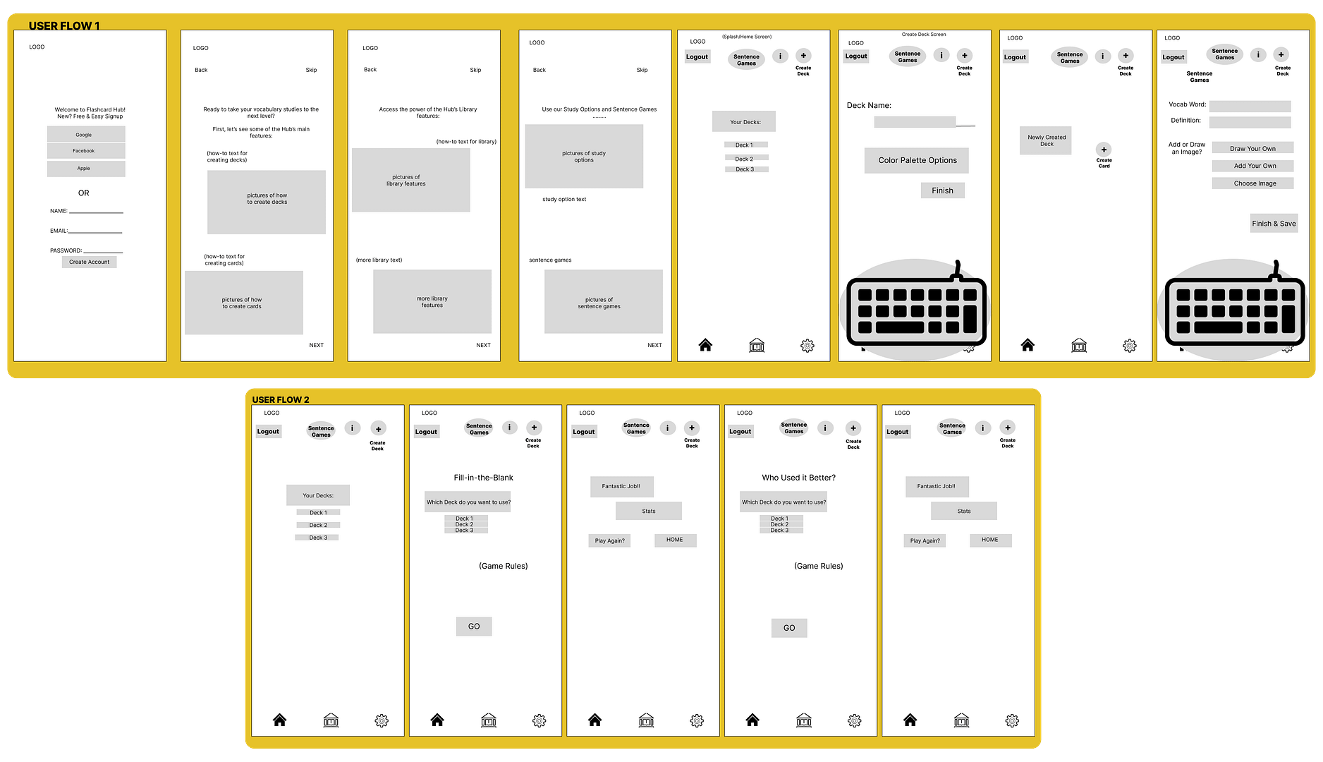
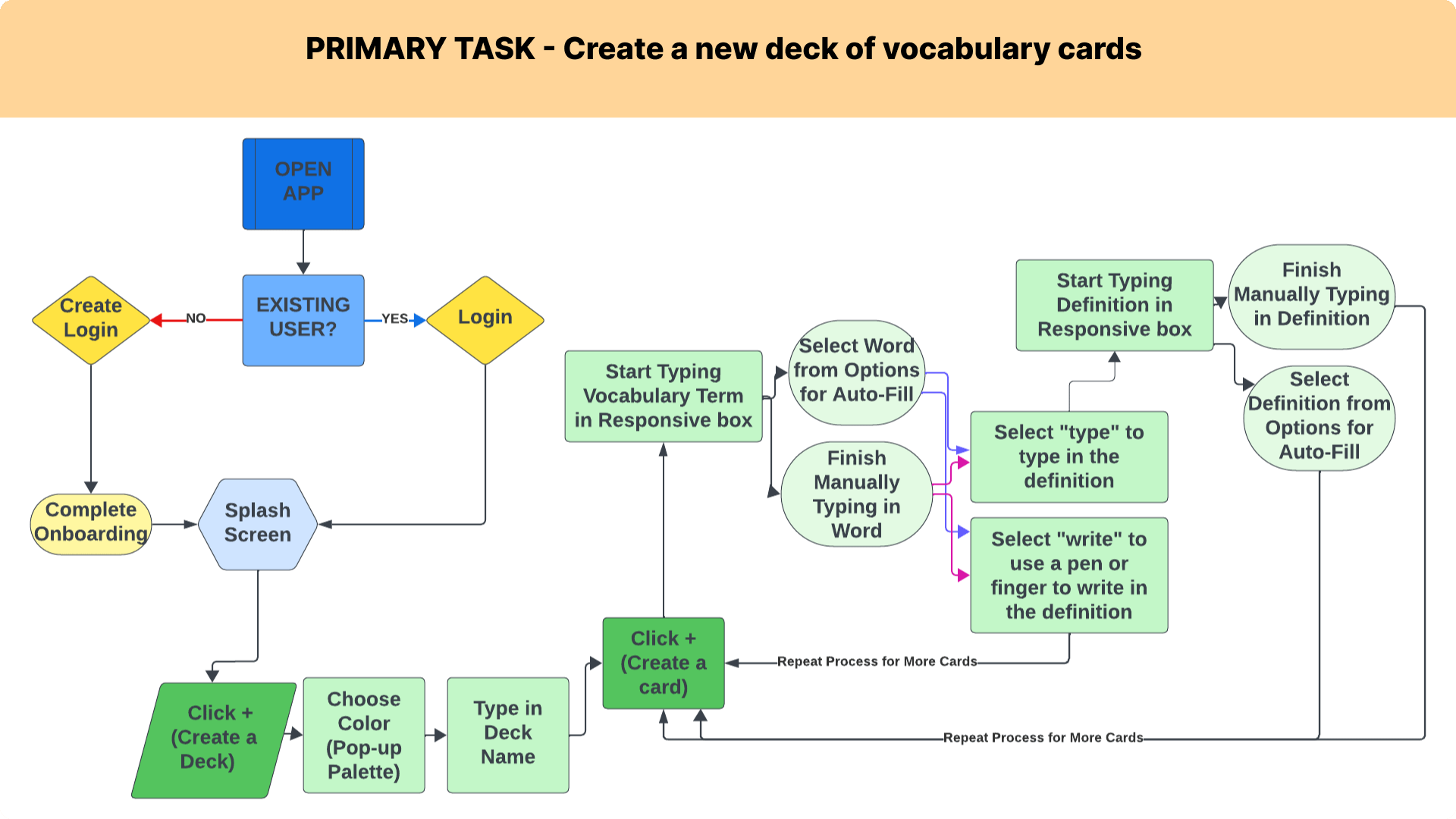
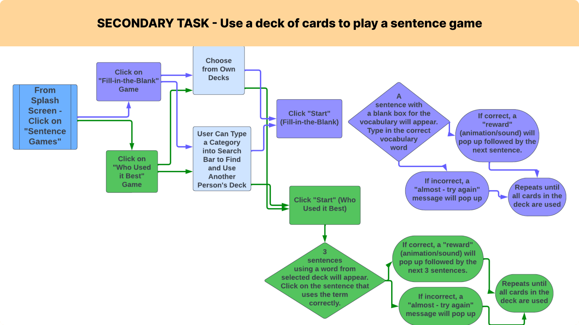
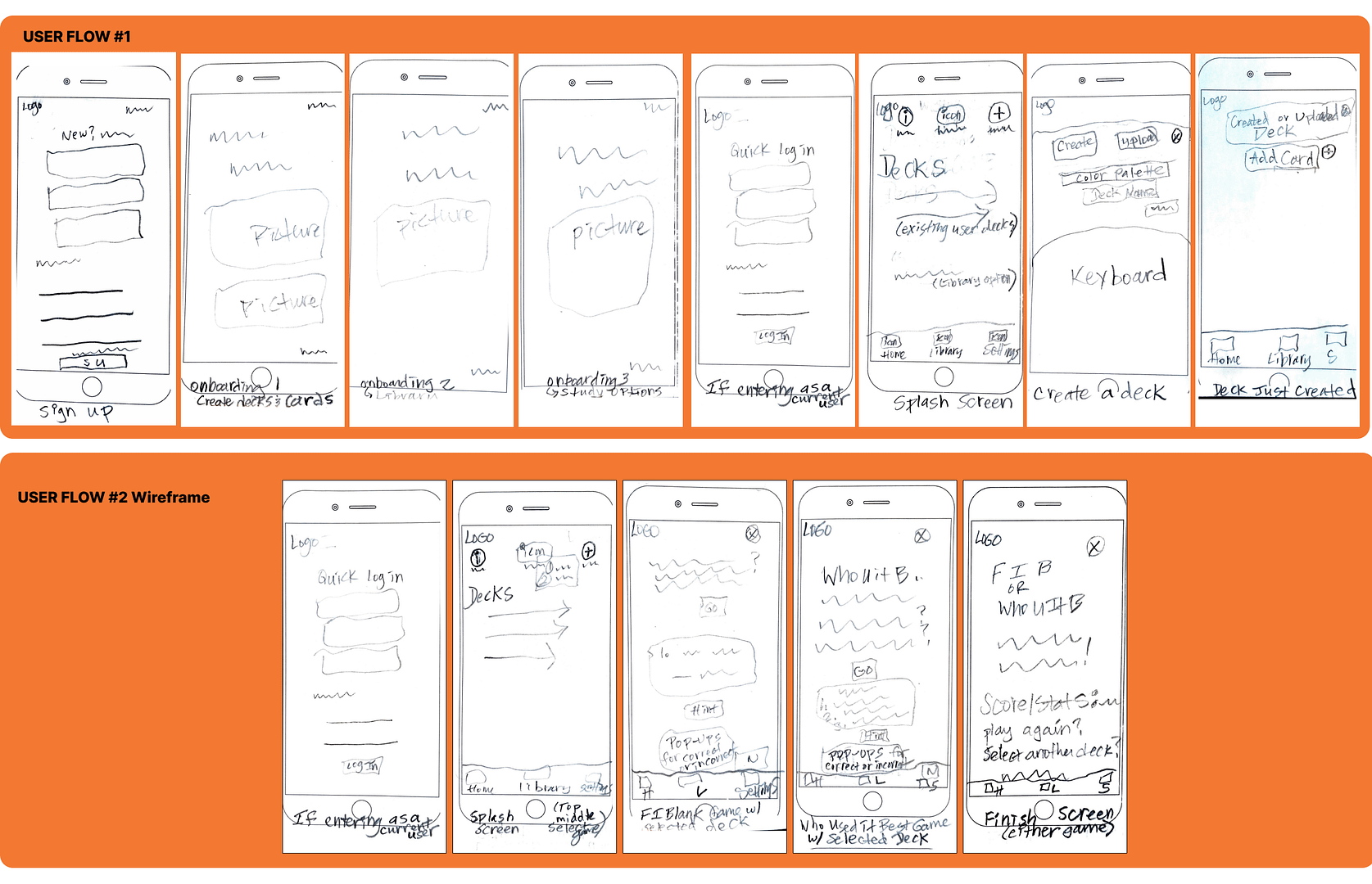
Task Analysis & User Flows


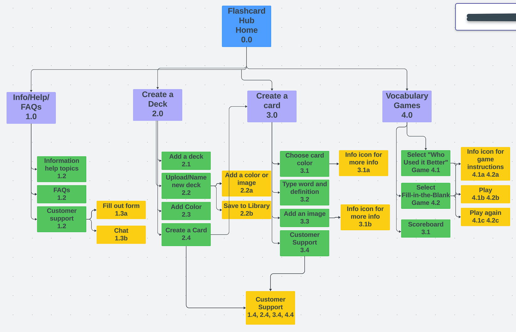
Sitemap & Low-Fidelity Wireframes
Usability Test
I recruited 5 18-24 year-olds for moderated, in-person testing of the low-fidelity prototype.
Participants were asked to perform certain tasks for the 2 user flows using the low-fidelity prototype.
Goals:
- Determine if test subjects understand the purpose and see the value in the app quickly and easily.
- Observe how easily subjects navigate through the 2 main prototype tasks to see where they get stuck or frustrated.
Positives:
- The sign-up was easy for all participants.
- All knew how to get to the next screen.
- All users liked the drop-down menu for games.
- All liked the stats button at the end of the game and liked the option to play again.
Negatives:
- Two mentioned the word “or” in between the email/password signup and the social signups would be helpful.
- 3 out of 5 were confused by the onboarding. Some suggested explanations of what onboarding is and how long it will take would be helpful.
- 4 of the 5 weren’t sure how to save a card in a deck – they wanted to see a confirmation that it was saved.
- All were frustrated about how to select the right deck to use in a game.
- When pushing “go” some said they still weren’t sure they were using the right deck.
- They all felt a “back” or “home” button at the end of the game would have made it easier.
Items to fix:
- Add the word “or” between regular and social signup options.
- Add brief text about onboarding so users know what it is and how long it will take.
- Remove “library” text. *Future test note, in the next round it would be helpful to see how users navigate specific parts of creating a deck or card.
- Icons for the games need to be clear with a text label added.
Pop-ups or other info snippets are needed to explain the games, especially how to select the correct deck. - Add a “back” or “home” button at the end of a game.
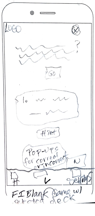
Before
Fill-in-the-Blank game - Users were confused with how to select a deck to use, and wanted to know more about what to expect when they hit go.
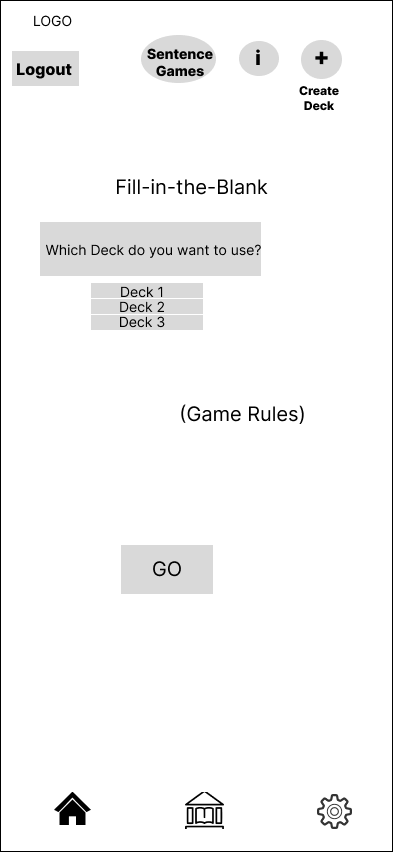
After
Fill-in-the-Blank game - Gave users easy access to their decks on the game page and added a section with game instructions.
Mid-Fidelity Wireframes
Reflections & Next Steps
I was asked to complete this project through mid-fidelity wireframes.
My next step would be to turn the wireframes into a prototype and use it to conduct my next 1-2 rounds of user testing. Ideally I’d also conduct a card sort.
