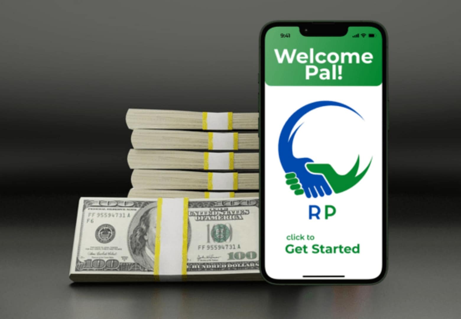
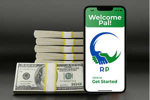
Retirement Pal
A mobile learning and budgeting app that helps users over 50 understand, plan, and support their retirement goals by showing them a full picture of their finances—all in one secure place.
Featuring Figma, Lyssna, LucidChart and good old pencil and paper.

The Beginning
At my mom’s 50th birthday someone asked her about her future retirement plans. She said she knew she “had some accounts” and laughingly commented “I hope it’s going to be enough”. When I asked her about it the next day, I realized she didn’t know if she was saving enough. 😯
She hates having so many apps and expressed how hard it was to look at 5 different apps to make sense of her overall retirement picture. 😧
Plenty of tools from spreadsheets to budget apps help track expenses, but rarely align directly with retirement goals. Some budget apps link accounts but don’t have retirement accounts as part of setup. 💰
This disconnect became the starting point for Retirement Pal: a mobile app that helps users over 50 (like my mom and her friends) plan and support their retirement goals by showing them a full picture of their finances and helping them set the best budget to reach them.

Where to start?
I needed to find out…
“Do most people have a retirement plan and know what’s in it?”
“Do people feel like they’ve saved enough for retirement?”
“What apps do people use to track their retirement plans?”
“What are other people my mom’s age doing to plan for retirement?”
“Are there any apps that are designed more for a 50+ audience?”
“Is there a need for this type of app?”
“Are there any budget apps that help people plan their retirement too?”
Research


In coffee shops and kitchens, I heard a recurring theme: “I want to understand my retirement plan but I don’t. I don’t know how to make my budget better reflect my retirement goals.”
They didn’t feel confident or empowered and wanted guidance. Nearly everyone mentioned security as a top concern. These insights became the heart of the design problem:
How do I create a seamless, secure, and supportive financial experience for users navigating one of life’s biggest challenges?
It was time to prioritize which flows to design first bearing in mind I’d need to
- Balance giving enough security information to reassure users with meeting the business’s need to promote retirement planning specialists during onboarding.
- Deliver just the right amount of educational content to help users set up budgets and retirement plans without overwhelming them, and
- Avoid feature bloat, ensuring the budget and retirement flows were intuitive yet valuable.
Competitive Analysis
Two competitors stood out:
YNAB (You Need a Budget) – A powerful, proactive tool that helps users rethink how they budget. But it’s generic in audience and assumes some financial fluency.
Charlie Financial – Designed specifically for the 62+ audience, combining banking with budgeting. But it lacks clarity in discoverability (SEO issues), and onboarding may overwhelm with detail.

What stood out? Each one has several strengths, but neither offered both retirement planning and budgeting. THAT was the sweet spot for Retirement Pal.
Personas

Loletha Jordan
Loletha has something many approaching retirement don’t: a financial advisor and a “pretty good retirement plan.” But when she tries to explain her retirement plan to her children, she realizes she can’t. She doesn’t really understand her own plan.

Rob Vaughn
Rob Vaughn retired last year without a formal plan, relying on his instincts and years of careful saving. Now he’s discovering that retirement is more expensive than he thought, and he’s feeling worried that his savings might not last long enough.
Although both Loletha and Rob represent potential users of the app, after developing their stories and journeys, I decided to focus on Loletha since she represents a larger part of the target audience.
My challenge – to create a(an)
- secure, user-friendly account creation and onboarding experience
- frictionless login process, and
- intuitive features for setting up retirement-friendly budgets and learning about or establishing retirement plans.
And to balance the above with business requirements, such as
- converting free trials to paid subscriptions
- signups to work with Retirement specialist
Flows and Wireframes
In Loletha’s experience, financial and budget apps are difficult and time-consuming to set up. She’s comfortable using her phone, but sometimes likes to use her desktop when working with numbers.
I believe by creating a secure, easy-to-use retirement app that allows Loletha to link to all her financial accounts, helps her understand her retirement plan, and assists her to easily set up a budget aligned with her plan, I will achieve Loletha being able to regularly track her budget and retirement plan progress and feel confident that her budget matches her plan.


I wanted the onboarding flow to reflect comments users made during interviews:
- Security as a top concern
- Something quick and easy to set up
- An actual connection between retirement plans and their budgets
More Iterations

After putting together more mid-fidelity flows, I ran two quick usability tests with two different groups – 50-64 year-olds and 65+. I wanted to see what their views would be on the retirement section of the app. 80% expressed interest in getting a free consultation from a retirement expert.
This would bring an additional revenue stream to the app, and was included in the next iteration.
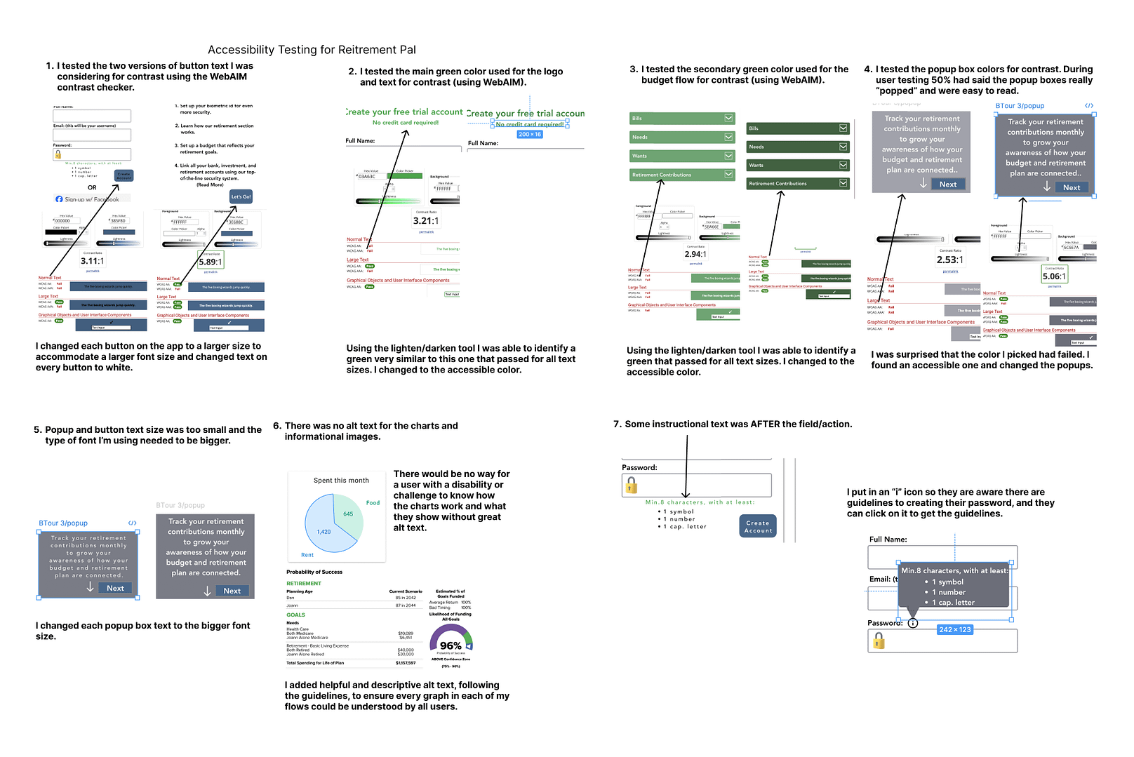
Accessibility Testing
Usability & Preference Tests
Usability
Goals:
- Determine if test subjects understand the purpose and value in the app quickly and easily.
- Observe how easily subjects navigate through the 3 main prototype tasks to see where they get stuck or frustrated.
Format:
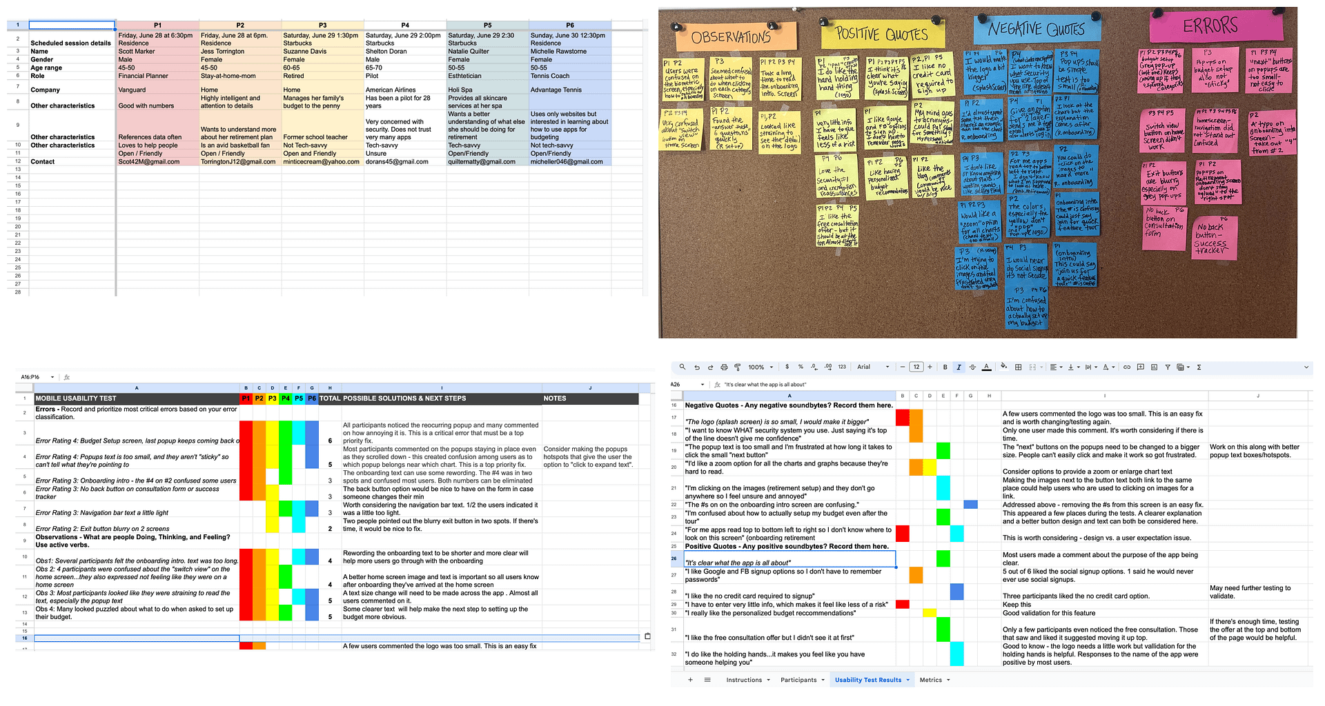
Moderated, in-person test with 5 people in the target audience, and 1 slightly younger (to see possible missed opportunities.
Insights:
- All participants noticed one pop-up that wouldn’t stay away after being clicked.
- All participants commented on the text size and readability on the darker screens.
- 4 struggled with the final budget setup process.
Fixes:
- Fix the pop-up and change pop-up format based on responses.
- Adjust the color scheme so text would be more visible and compliant.
- Reworking the budget flow to make it simpler.
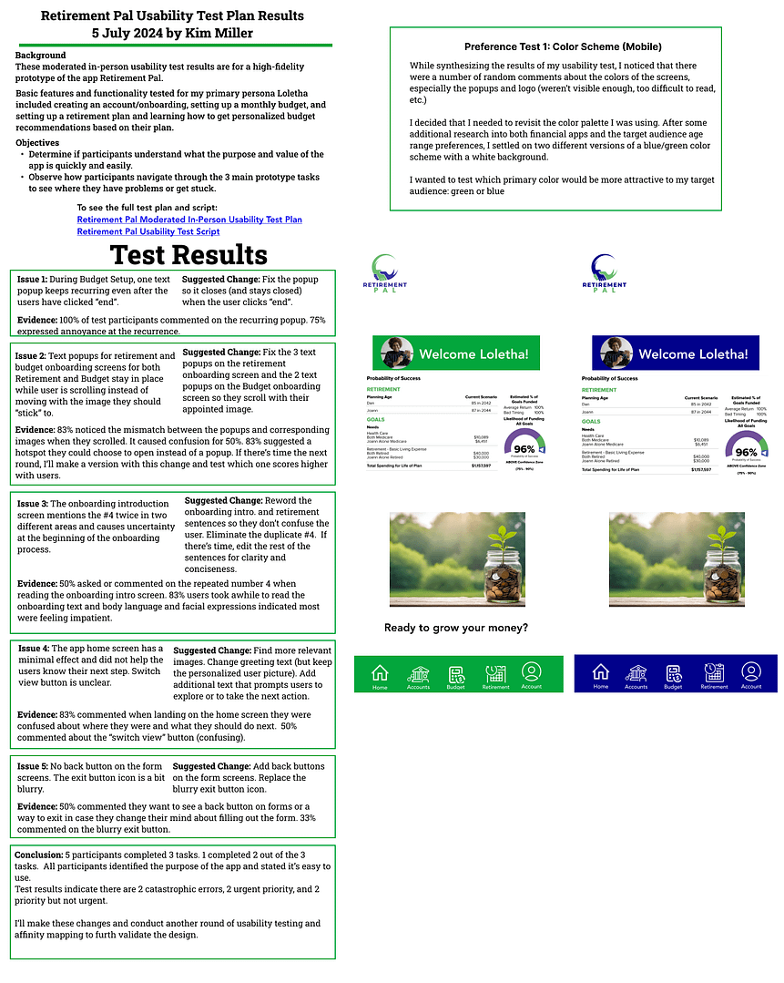
Preference
Goals:
- To find out which color scheme does better with the target audience.
- The overall response to the size of text on various parts of the app.
Format:
Anonymous 25 participant (12 question) test through Lyssna (UX research platform).
Insights:
- A surprising 85% participants preferred the green. I thought blue would win – another reminder why we do preference testing!
- 70% still had issues with some of the smaller text.
Fixes:
- Changed the color palette to the preferred green with variations throughout.
- Adjusted the text in all areas based on test feedback.
Reflections & Next Steps
Top lessons learned:
- My ideas of helpful features are NOT always the same as the target audience.
- Through initial user interviews and survey I was surprised to learn that only a few were interested in a rewards feature.
- Cardsorting and Emapthy Mapping helped me see and correct flaws in the sitemap.
- The color scheme I thought would “win” in the preference test, didn’t.
Next Steps:
- Conduct one more round of usability testing with the revised prototype.
- Run the prototype by 3 colleagues again for more input.